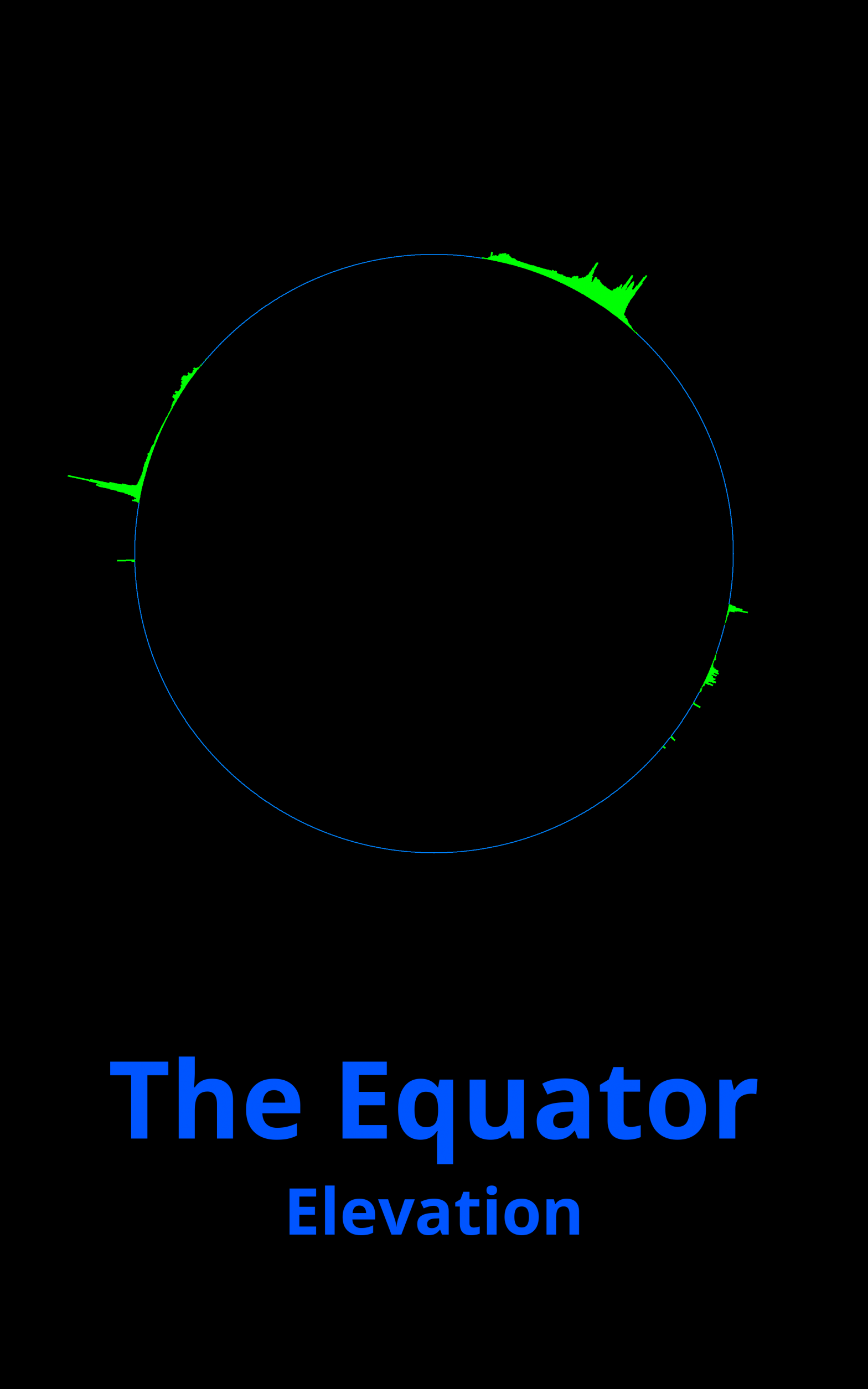
Playing around with elevation data, I put together a visualization of the elevation around the equator. The left starts at the date line in the
Category: Programming
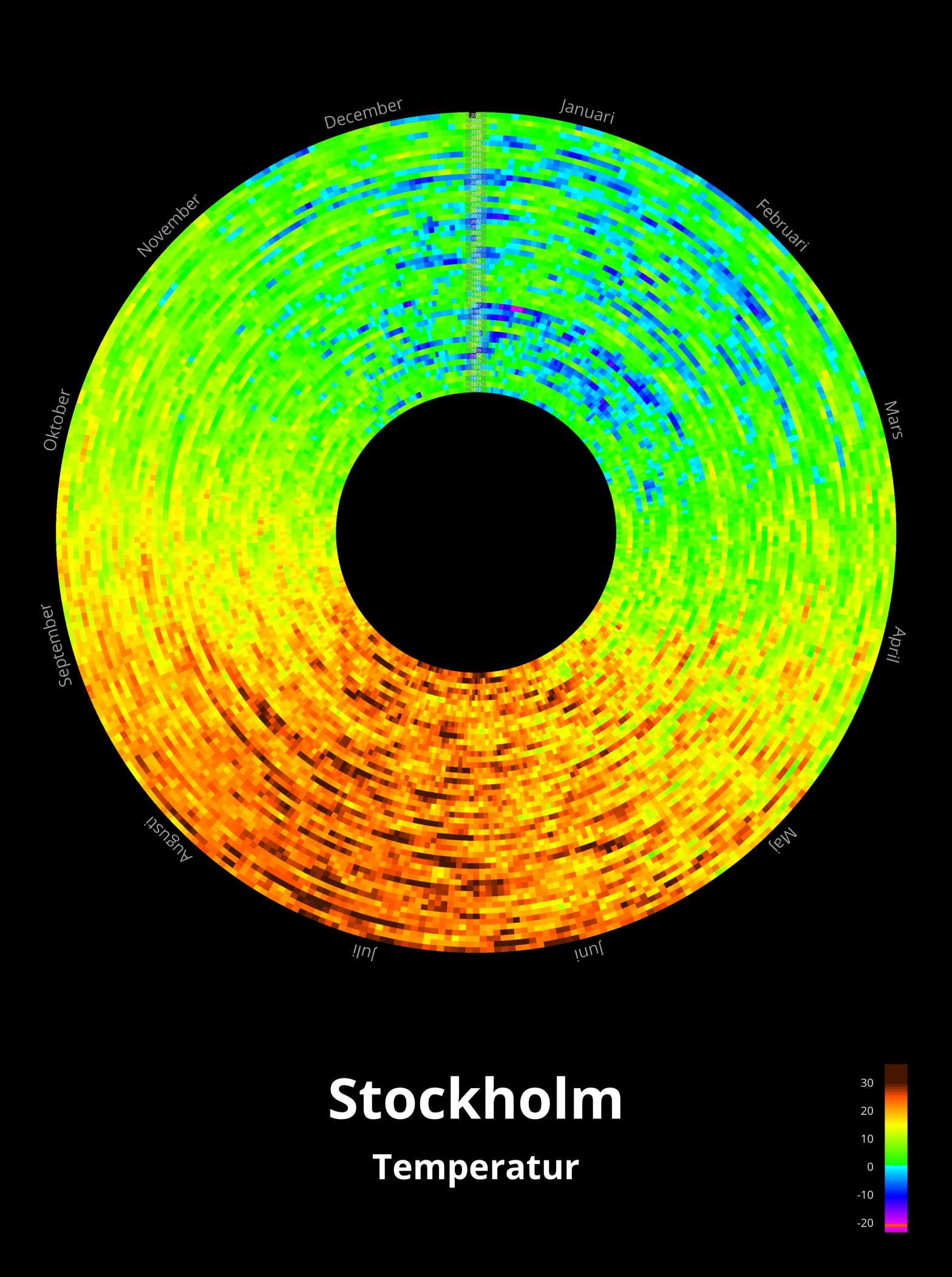
This is another take on the temperature data from Observatorielunden in Stockholm. Instead of doing it in a matrix as in Temperature, I wanted to
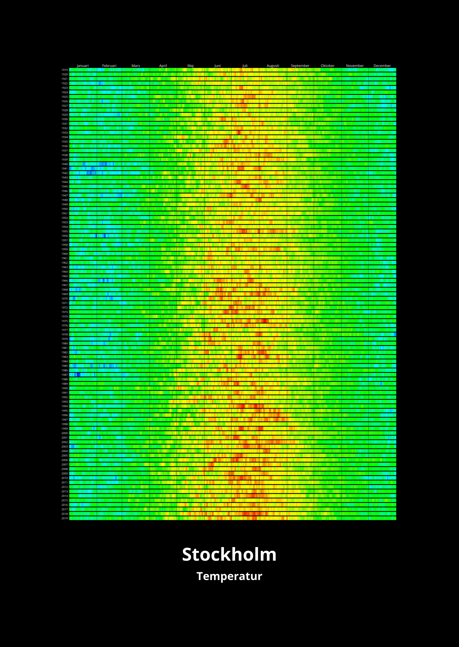
I was playing around with data from SMHI to see what I could visualize. I took the temperature data at noon at the weather station
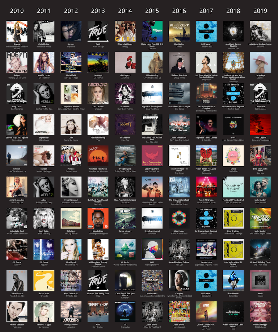
While experimenting with the Spotify API to make the visualization of album cover colors over the years, I also created a picture of the top
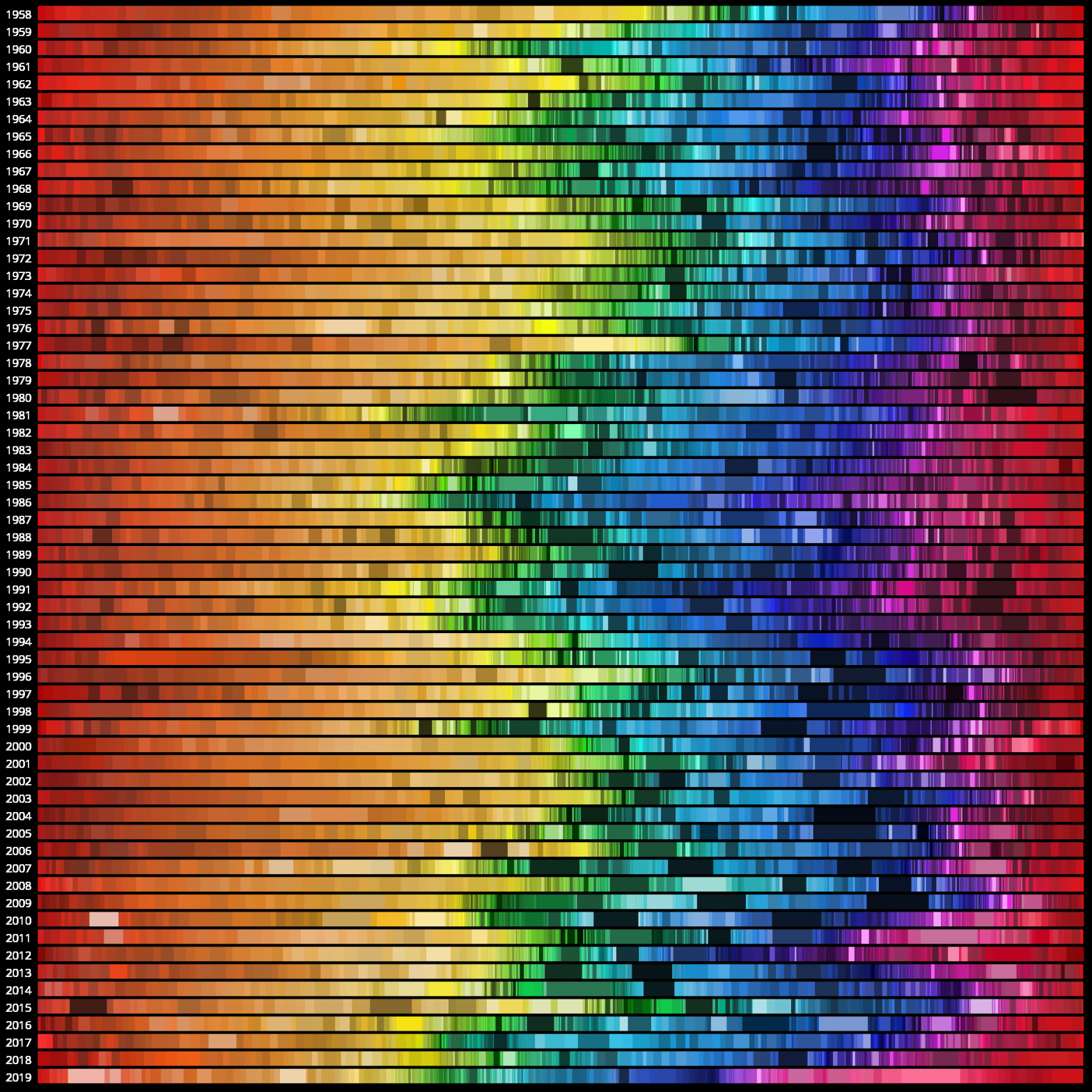
I was fascinated by the visualization that Vijay Pandurangan did about how the colors of movie posters have evolved over almost a century. It made

I was experimenting with the programming environment Processing and reading the pixels of an image. I then did something along the lines of:
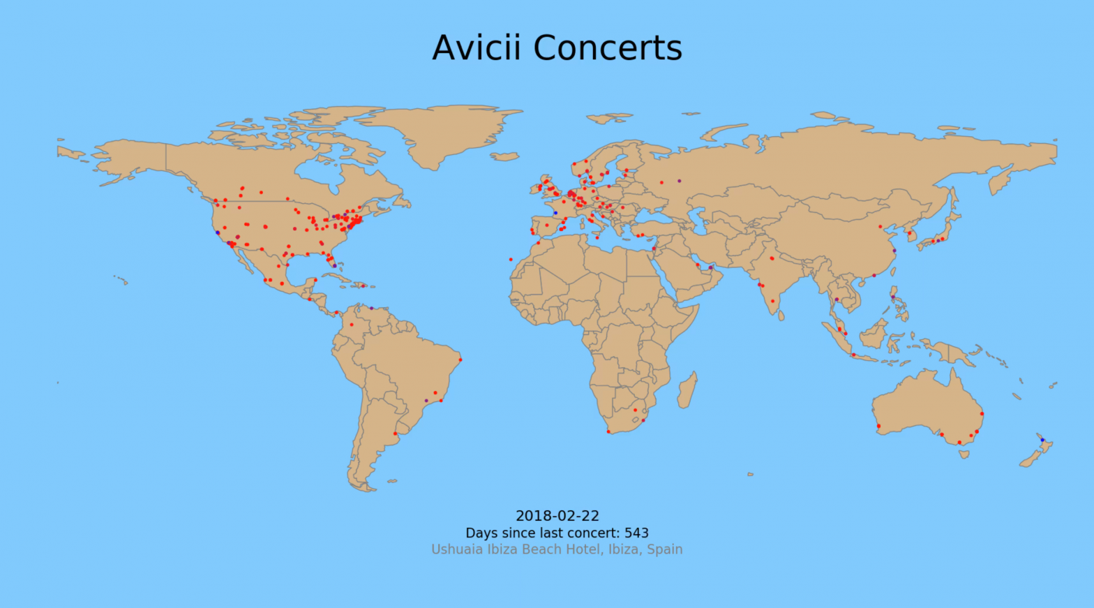
After watching the Avicii documentary, and seeing how much pressure he was under to perform, I wanted to look into how often he did concerts.