I was fascinated by the visualization that Vijay Pandurangan did about how the colors of movie posters have evolved over almost a century.
It made me wonder if I could do something similar for music albums. Specifically, I though I could look at the top singles for a year, and compare the colors in a similar way to how Vijay did it.
I started looking for a data source, and found a dataset with Billboard’s top 100 singles from the year 1958 to 2019.
I wrote a Python script that filtered out all songs that had had a top 10 hit for each year. This varied between around 60 songs to 110 songs each year. For each song, the script downloaded the album cover from Spotify. It took a while to make the search query correct. First I wanted to just have the singles covers. I realized that the singles covers don’t always exist, especially for older songs. So I was OK with the album covers too. I went through all the pictures by hand after downloading, removing compilations and karaoke pictures and other false matches.
After I had the pictures, I wrote a script that went through all the pixels of the pictures and stored the hue, saturation and lightness values.
For each year, the script then calculated the average hue, saturation and lightness.
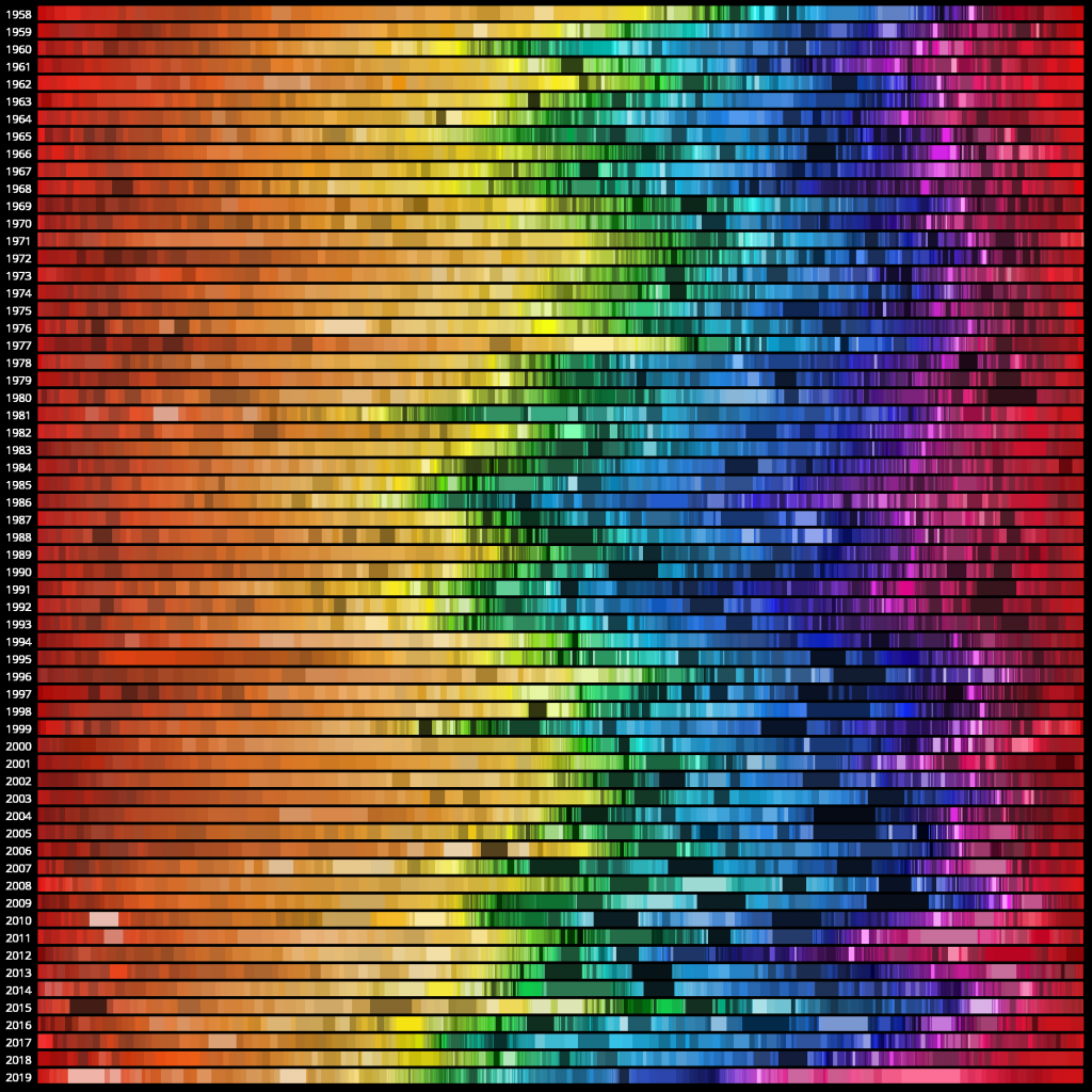
Then it visualized each year by placing it on its own row, showing all the colors of the color wheel from left to right, making the space each color takes up being determined by how often it was used by the album covers of that year.
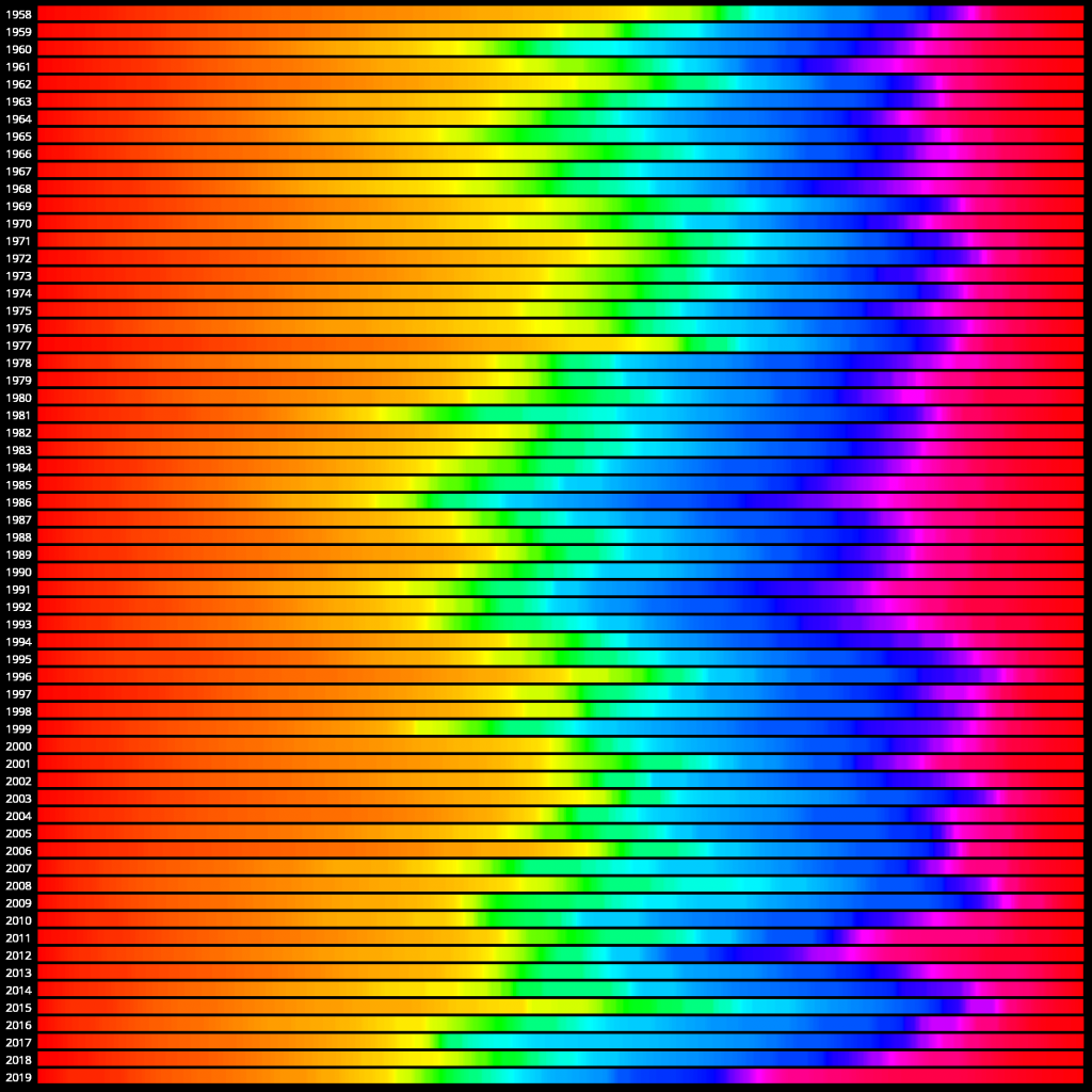
The visualization with 100% saturation and 50% lightness looks like this:
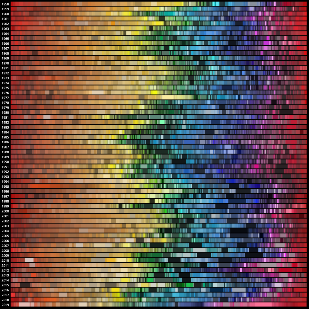
If instead of having full saturation and full lightness, using the average numbers calculated in the previous steps, the picture looks like this:
That looked a bit bland. So I experimented with the saturation, and ended up mapping the saturation values that go from 0 to 100 to be between 40 and 100 instead: